

在临床医学实践中,生存分析是一种重要的研究方法。生存分析是研究生存时间的分布规律,以及生存时间和相关因素之间关系的一种统计分析方法。它主要的目的是对生存率和时间进行建模,计算患者在特定时间段内生存的概率,主要用于评估治疗的效果和疾病的危险程度。
生存分析的方法一般可以分为三类:
参数法:知道生存时间的分布模型,然后根据数据来估计模型参数,最后以分布模型来计算生存率 。
非参数法:不需要生存时间分布,根据样本统计量来估计生存率,常见方法Kaplan-Meier法(乘积极限法)、Log-rank检验等
半参数法:也不需要生存时间的分布,但最终是通过模型来评估影响生存率的因素,最为常见的是Cox回归模型 。
生存曲线(survival curve)则是将每个时间点的生存率连接在一起的曲线,一般随访时间为X轴,生存率为Y轴;曲线平滑则说明高生存率,反之则低生存率;中位生存率(median survival time)越长,则说明预后较好。本文主要介绍生存曲线的绘制。
安装与加载
install.packages("survminer")
library("survminer")
ggsurvplot绘制生存曲线
#调用survival包
require("survival")


#survival包自带肺癌数据集:lung,查看数据样式
head(lung)

> head(lung)
  inst time status age sex ph.ecog ph.karno pat.karno meal.cal wt.loss
1    3  306      2  74   1       1       90       100     1175      NA
2    3  455      2  68   1       0       90        90     1225      15
3    3 1010      1  56   1       0       90        90       NA      15
4    5  210      2  57   1       1       90        60     1150      11
5    1  883      2  60   1       0      100        90       NA       0
6   12 1022      1  74   1       1       50        80      513       0
绘制基础版单一分组的生存曲线
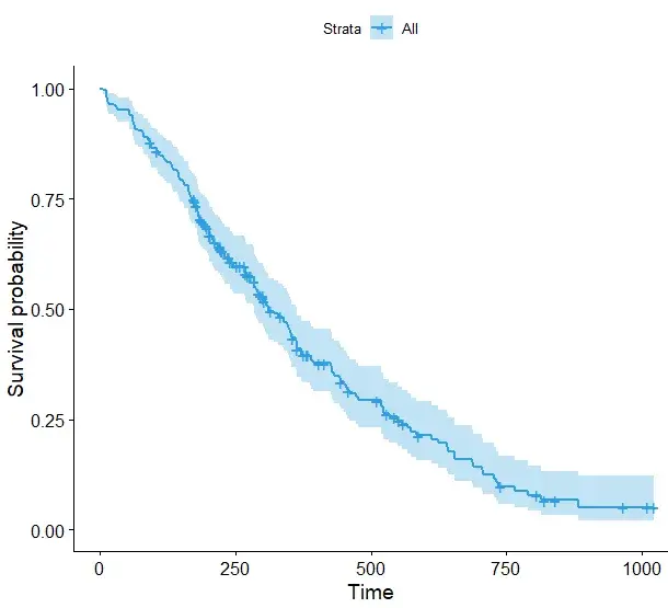
#通过survival包的Surv函数对时间及生存状态进行拟合(检验: Kaplan-Meier法)
fit1 <- survfit(Surv(time, status) ~ 1, data = lung)
#绘制基础版生存曲线
ggsurvplot(fit, palette = "#2E9FDF") #自定义修改颜色
绘制两组的生存曲线
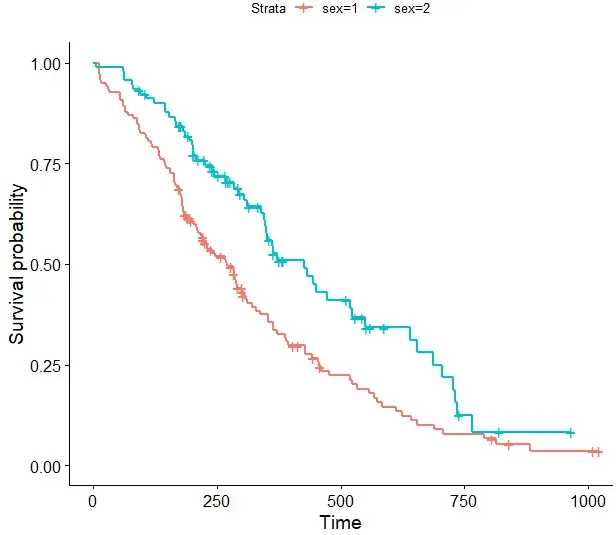
#以性别特征进行分组为例
#绘制基础图形
fit <- survfit(Surv(time, status) ~ sex, data = lung)
ggsurvplot(fit, data = lung)
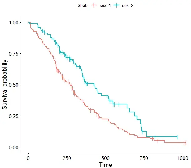
#更改删失点形状及大小,默认为"+", 可选"|"
ggsurvplot(fit, data = lung, censor.shape="|", censor.size = 4)
# 使用啤酒调色板“Dark2”
ggsurvplot(fit, linetype = "strata",
           conf.int = TRUE, pval = TRUE,
           palette = "Dark2")
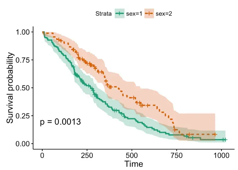
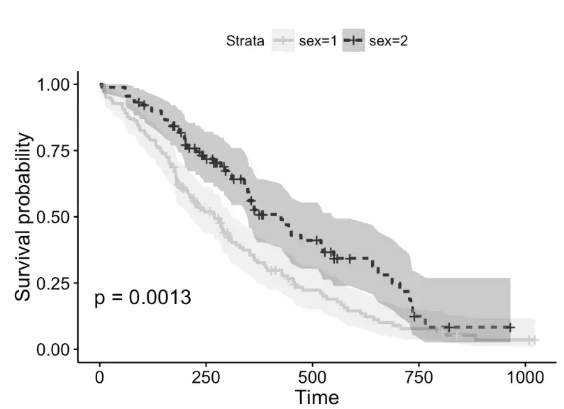
# 使用灰色调色板
ggsurvplot(fit, linetype = "strata",
           conf.int = TRUE, pval = TRUE,
           palette = "grey")
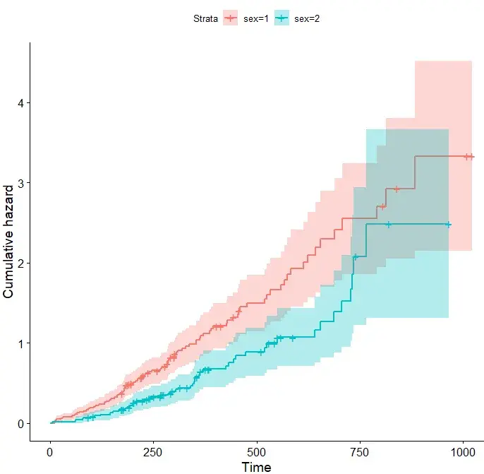
#还支持累计风险曲线绘制
ggsurvplot(fit, data = lung,
           conf.int = TRUE, # 是否需要增加置信区间
           fun = "cumhaz") # cumhaz函数绘制累计风险曲线
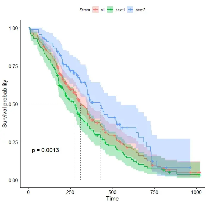
# 指定数据,添加总患者生存曲线
ggsurvplot(fit, # 分组拟合对象
           data = lung,  # 使用的变量数据集来源
           conf.int = TRUE, # 是否显示显示置信区间
           pval = TRUE, # 通过 pval 添加P值
           surv.median.line = "hv",  # surv.median.line添加中位生存时间线
           add.all = TRUE) # add.all 添加总患者生存曲线
# 通过修改函数接口,制定个性化的生存曲线
ggsurvplot(
fit,
data = lung,
size = 1, # 线条粗细
palette =
c("#E7B800", "#2E9FDF"),# 设置分组颜色
conf.int = TRUE, # conf.int 函数添加置信区间
pval = TRUE, # p值函数添加显著性
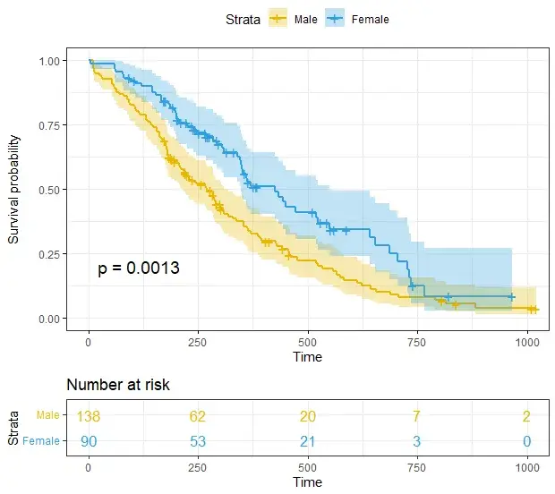
risk.table = TRUE, # 添加风险表个绘制
risk.table.col = "strata",# 分线表颜色
legend.labs =
c("Male", "Female"), # 添加对应图例标签
risk.table.height = 0.25, # 生存曲线图下所有生存表的高度,数值0-1之间
ggtheme = theme_bw() # 是否添加图主题
)
# 修改参数,更加个性化的生存曲线图绘制
ggsurvplot(
   fit,
   data = lung,
   risk.table = TRUE,
   pval = TRUE,
   conf.int = TRUE,
   xlim = c(0,500),      # xlim, ylim 函数指定x轴和y轴的范围        xlab = "Time in days",   # xlab, ylab 这两个函数分别指x轴和y轴标签
   break.time.by = 100,     # 设定坐标轴刻度间距大小,按需设置
   ggtheme = theme_light(),
 risk.table.y.text.col = T, # 分线表y轴文字字体颜色,可修改
  risk.table.y.text = FALSE # 风险表y轴展示条形图例
)
# Uber定制生存曲线
ggsurv <- ggsurvplot(
           fit,
           data = lung,
           risk.table = TRUE,
           pval = TRUE,
           conf.int = TRUE,
           palette = c("#E7B800", "#2E9FDF"),
           xlim = c(0,500),
           xlab = "Time in days",
           break.time.by = 100,
           ggtheme = theme_light(),
          risk.table.y.text.col = T,
          risk.table.height = 0.25,
          risk.table.y.text = FALSE,
          ncensor.plot = TRUE,
          ncensor.plot.height = 0.25,
          conf.int.style = "step",
          surv.median.line = "hv",
          legend.labs =
            c("Male", "Female")
        )
ggsurv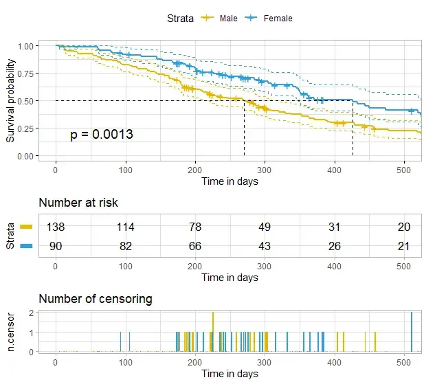
# 引入customize_labels 函数进行更高级的定制,这种函数可作为source对象,加在之后可以直接绘制相应的生存曲线
customize_labels <- function (p, font.title = NULL,
font.subtitle = NULL, font.caption = NULL,
font.x = NULL, font.y = NULL, font.xtickslab = NULL, font.ytickslab = NULL)
{
original.p <- p
if(is.ggplot(original.p)) list.plots <- list(original.p)
else if(is.list(original.p)) list.plots <- original.p
else stop("Can't handle an object of class ", class (original.p))
.set_font <- function(font){
font <- ggpubr:::.parse_font(font)
ggtext::element_markdown (size = font$size, face = font$face, colour = font$color)
}
for(i in 1:length(list.plots)){
p <- list.plots[[i]]
if(is.ggplot(p)){
if (!is.null(font.title)) p <- p + theme(plot.title = .set_font(font.title))
if (!is.null(font.subtitle)) p <- p + theme(plot.subtitle = .set_font(font.subtitle))
if (!is.null(font.caption)) p <- p + theme(plot.caption = .set_font(font.caption))
if (!is.null(font.x)) p <- p + theme(axis.title.x = .set_font(font.x))
if (!is.null(font.y)) p <- p + theme(axis.title.y = .set_font(font.y))
if (!is.null(font.xtickslab)) p <- p + theme(axis.text.x = .set_font(font.xtickslab))
if (!is.null(font.ytickslab)) p <- p + theme(axis.text.y = .set_font(font.ytickslab))
list.plots[[i]] <- p
}
}
if(is.ggplot(original.p)) list.plots[[1]]
else list.plots
}
#用户自定义生存曲线
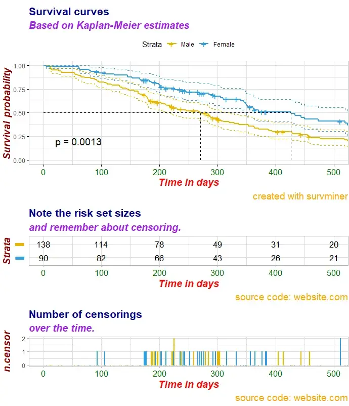
ggsurv$plot <- ggsurv$plot + labs(
title = "Survival curves", #主标题,可改写
subtitle = "Based on Kaplan-Meier estimates", #添加副标题
caption = "created with survminer" # 是否需要说明
)
ggsurv$plot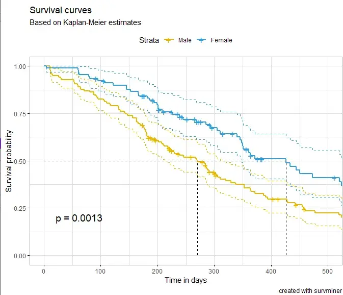
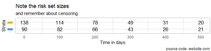
# 单独绘制风险表格
ggsurv$table <- ggsurv$table + labs(
  title    = "Note the risk set sizes",
  subtitle = "and remember about censoring.",
  caption  = "source code: website.com"
  )
ggsurv$table
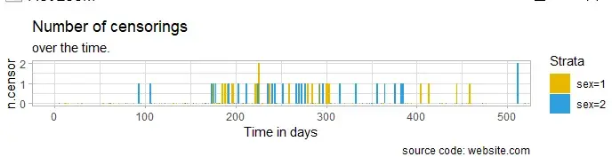
# 绘制删失图标签
ggsurv$ncensor.plot <- ggsurv$ncensor.plot + labs(
  title    = "Number of censorings",
  subtitle = "over the time.",
  caption  = "source code: website.com"
  )
ggsurv$ncensor.plot
# 自定义修更改字体大小、类型和颜色
ggsurv <- customize_labels(
  ggsurv,
  font.title    = c(16, "bold", "darkblue"),
  font.subtitle = c(15, "bold.italic", "purple"),
  font.caption  = c(14, "plain", "orange"),
  font.x        = c(14, "bold.italic", "red"),
  font.y        = c(14, "bold.italic", "darkred"),
  font.xtickslab = c(12, "plain", "darkgreen")
)
ggsurv
绘制多组生存曲线图
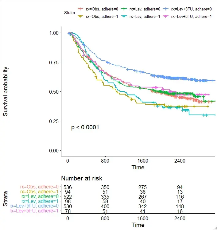
# 多组生存曲线也可以调用相应的函数来绘制
# 再来看看内置数据集colon
head(colon)

> head(colon)
  id study      rx sex age obstruct perfor adhere
1  1     1 Lev+5FU   1  43        0      0      0
2  1     1 Lev+5FU   1  43        0      0      0
3  2     1 Lev+5FU   1  63        0      0      0
4  2     1 Lev+5FU   1  63        0      0      0
5  3     1     Obs   0  71        0      0      1
6  3     1     Obs   0  71        0      0      1
  nodes status differ extent surg node4 time etype
1     5      1      2      3    0     1 1521     2
2     5      1      2      3    0     1  968     1
3     1      0      2      3    0     0 3087     2
4     1      0      2      3    0     0 3087     1
5     7      1      2      2    0     1  963     2
6     7      1      2      2    0     1  542     1

#rx分组
fit2 <- survfit( Surv(time, status) ~ rx + adhere,
    data = colon )
ggsurvplot(fit2, pval = TRUE,
           break.time.by = 800,
           risk.table = TRUE,
           risk.table.height = 0.5
           )
实验外包 想了解更多请关注:https://www.do-gene.com


